Nike – Design System
Nike – Design System
Our challenge was to introduce a unified creative system for Nike and it’s most iconic product.
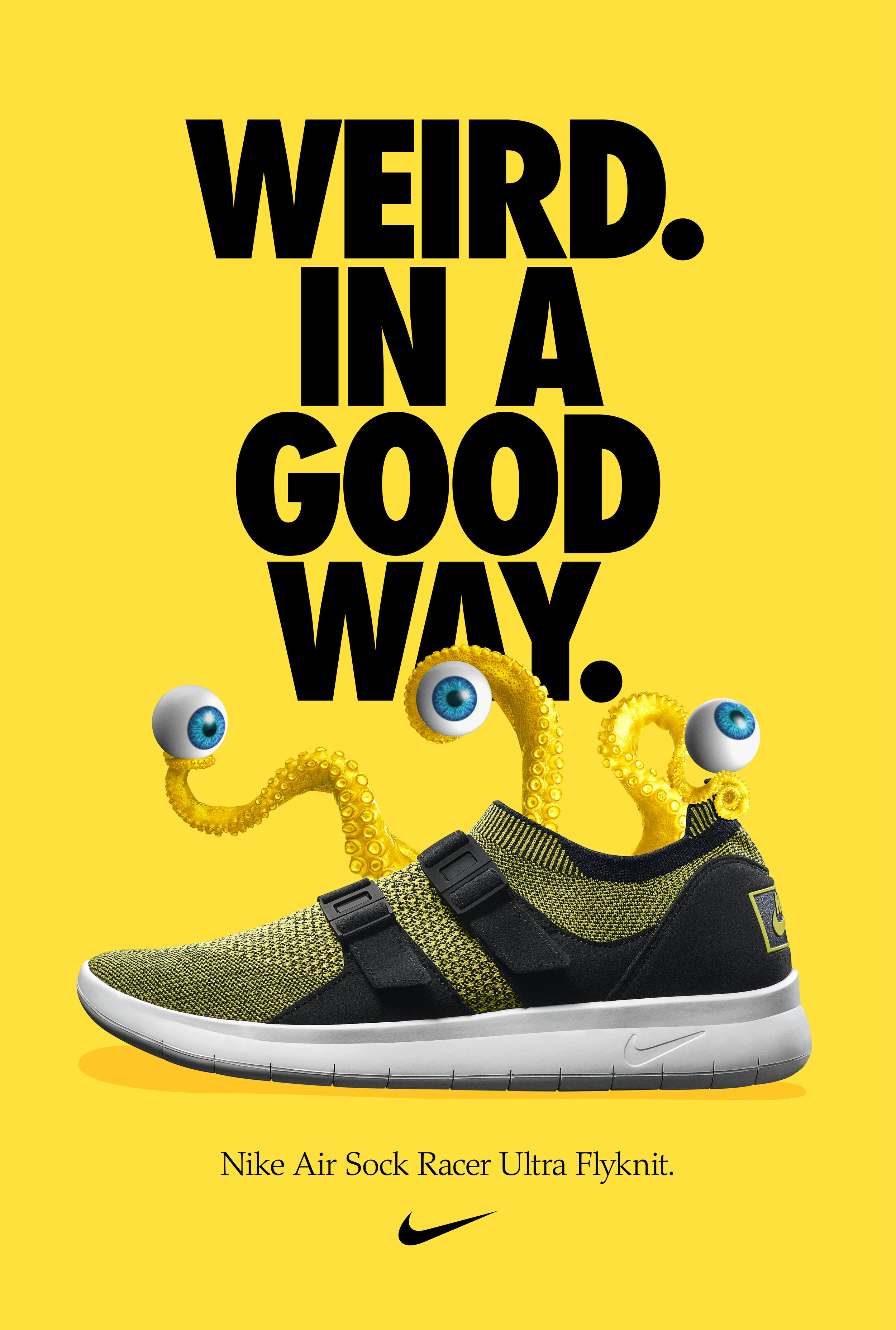
We created a product superiority initiative that obsessed and elevated Nike’s icons. Additionally we established consistent design principles across all of Nike’s channels.
The direction was to strip away as much marketing noise as possible.
We shot the product at dynamic but realistic angles, no floating shoes : )
Equity was built in the product name by setting it in the same oblique Futura typeface as the Nike master brand.
The third and final element was adding the swoosh logo. Simple.
The system was used for Nike’s Power Franchise products across print, retail, OOH and digital. For digital in particular we worked with the Nike Digital Design
Outcomes
The system was rolled out globally across all Nike’s design studios and used in all marketing channels and points of purchase.
The approach resulted in more efficient work streams and huge reduction on creative agency and retail door spend spread, resulting in more time and money being made available for the key campaign moments.
The new optimized Nike Futura has been rolled out in all Latin, Cyrillic and Greek languages.
YOY Nike App downloads from paid media utilizing the Nike System grew 467% (2018 -2019).
Credits
Creative Director: Meirion Pritchard.
Strategic Lead: Jon Hum
Designer: Noah Beckwith
Agency: Golden
Agency (Motion): Gretel NY


